
Red Agent Swarms for Testing Customer-Facing AI Agents
LLM applications have a semi-infinite attack surface, and they are notoriously hard to secure without breaking the user experience.
AI
LLM
AI Safety

A short guide about how I use my inbox to make a little more sense of the world.
There are times when we all have that nagging sensation that a task, or a whole project, is taking a bit longer than we would like. Most of the time, we can use things like issue tracking systems or even a git change log to get an idea of what these timelines look like. Fire up a report, or install a plugin to do the same, and it's easy to see what's going on. Timelines jump off the page with little to no effort, keeping leads and managers happy.
What can be done if you have no such luxuries? It turns out that good old-fashioned email can actually provide some insight into project timelines. The trick is to treat it like a data stream and extract the information you need with a little code.
The following is a step-by-step guide to building a Python program scaffold for answering this question and more. The article structure is also well-suited to Jupyter notebooks, which is recommended to reduce run-times while iterating on your own solution.
To get started, make sure your environment has the imbox, pandas, and
plotly python modules installed.
# install dependencies
pip install --upgrade imbox pandas plotlyThat’s not a typo, nor an example of typosquatting. Imbox is a fantastic
Python module that makes short work of interfacing with IMAP. In my case that
was the public Gmail service, but this would also work with any IMAP server like
Outlook.
from imbox import Imbox

# NOTE: provide your own configuration
imap_ssl_host =
username =
password =

parties = [
  # list of email addresses you care about
]

# where we will put all our raw data
messages = {}

# log in and iterate over
with Imbox(imap_ssl_host,
        username=username,
        password=password,
        ssl=True,
        ssl_context=None,
        starttls=False) as imbox:

    for person in parties:
        for uid, msg in imbox.messages(folder='all', sent_from=person):
            messages[uid] = msg
        for uid, msg in imbox.messages(folder='all', sent_to=person):
            messages[uid] = msg
        for uid, msg in imbox.messages(folder='sent', sent_to=person):
messages[uid] = msgIn order to work with the raw data we get from our IMAP server, we need to clean it up. There are a few things we need to solve here: noise, subject correlation, and Pandas alignment.
Let’s start with an all-in-one function that cleans up our data. Note that the
belowI’ll add that the built iteratively by print()-ing records and observing
what values were at play. This will work as a starting point, and you will want
to tune this to suit your data.
from datetime import datetime

def msg_to_dict(msg):
    subject = msg.subject
    subject = subject.strip()
    if subject == "":
        subject = "(no subject)"

    # clean whitespace
    subject = subject.replace("\r\n", "")

    # slice off prefix
    for prefix in ["RE: ", "Re: ", "FW: ", "Fw: ", "Fwd: "]:
        if subject.startswith(prefix):
            subject = subject[len(prefix):]

    # slice off suffix
    for suffix in [" (Sent Securely)"]:
        if subject.endswith(suffix):
            subject = subject[:-len(suffix)]

    # dict-ify the message
    return dict(
        sender=msg.sent_from[0]['email'],
        subject=subject,
        date=datetime.strptime(msg.date,"%a, %d %b %Y %H:%M:%S %z"),
    )
There are probably better ways to do this, but the above code gets the job done.
With respect to correlating all messages in their respective chains, this is the most crucial part of all our preprocessing. In the end, all that matters is that related messages all wind up with some reliably correlating field to use in our plots (below). With this cleanup pass, the subject line is now that correlating field.
This function strips all the prefix and suffix noise off of titles, letting the
remaining text line up. Most of the time, people don’t modify subject lines
when replying or forwarding email, and in my dataset this is reliable enough.
There are In-Reply-To and Message-ID message headers that can be used to
construct reply chains, but this naive subject cleaning was so effective, that I
didn’t need them.
Now that we can convert raw message data to nice clean dictionaries, let’s use that to build a Pandas dataframe.
import pandas as pd

# tidy one-liner for building our dataframe
df = pd.DataFrame([msg_to_dict(msg) for uid, msg in messages.items()])With a dataframe in hand, the next step is to use Pandas to filter out unwanted
records. I could have built this into the list comprehension earlier, or done
something clever in msg_to_dict(), but this is probably the least complicated
way.
There are some subjects that indicate stuff we don’t care about. Like before, this is just a starting point, and these values were discovered iteratively. You’ll probably want to start with this code, see what the Plotly output looks like (below) and then circle back to tune this up.
# filter out undesired data
df = df[~df["subject"].str.startswith("Automatic reply")] # OOO
df = df[~df["subject"].str.startswith("Tentative")]  # meeting invite
df = df[~df["subject"].str.startswith("Canceled")]  # meeting invite
df = df[~df["subject"].str.startswith("Accepted")]  # meeting invite
df = df[~df["subject"].str.startswith("Updated invitation")] # meeting inviteNow, on to the good stuff. We will take all our tidy and filtered data and try
to make some sense of it. Your use of this data can, and should, go beyond the
following examples. For me, these graphs made the most sense for discovering
conversation lifetimes in all this email traffic. Depending on your needs, you
may also want to go back to msg_to_dict and add additional fields derived from
the raw message data.
First, let’s see what a scatter plot of senders by date and subject looks like. This is useful to get an idea of who is responsible for most of this email, and when.
import plotly.express as px
import plotly.graph_objects as go

# display point graph
fig = px.scatter(df, x="date", y="sender", color="subject", hover_data=["subject"])
fig.update_yaxes(tickmode='linear')
fig.update_layout(margin_pad=10, height=600)
fig.show()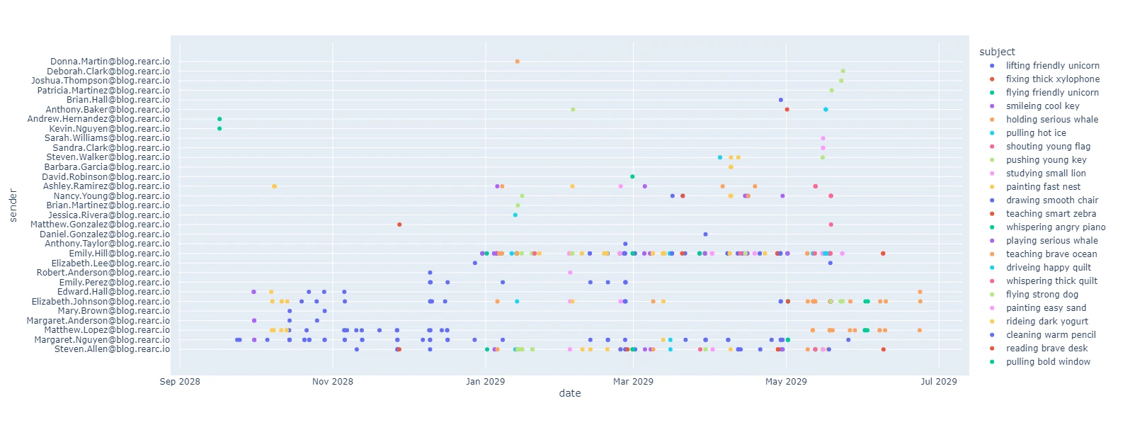
Author's note: Senders and subjects were changed to protect the innocent.
Next, let’s see a line graph of email subjects by date. This proved very helpful in illustrating which subjects took the longest, and generally, how long each subject took.
# display timeline graph
fig = px.line(df, x="date", y="subject", color="subject", markers=True)
fig.update_yaxes(tickmode='linear')
fig.update_layout(margin_pad=10, height=600)
fig.show()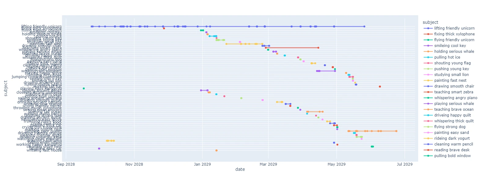
Author's note: These senders and subjects are also completely fictional.
Pretty, yes. But what does it all mean?
From just two graphs I was able to draw a few conclusions. We were taking a few weeks to discuss and resolve many issues, and few lasted much longer than that. This matched some of my recollection of events, but the outliers were complete surprises. It turns out that it’s really hard to keep a perfect memory for months of email discussions, in a way that maps to multiple coherent timelines.
Sharing these illustrations helped shape discussions with all parties involved, as it was clear these long timelines were not some invention but actual hard data. I was able to draw attention to this problem, providing some motivation for change. At the same time, I committed to forecasting future events based on a two week “waiting period” based on this data.
In the end, it turned out that all I needed was a good illustration to make sense of it all.
Read more about the latest and greatest work Rearc has been up to.
LLM applications have a semi-infinite attack surface, and they are notoriously hard to secure without breaking the user experience.

Recently, articles surrounding the supposed dangers of an open source abliteration tool called Heretic, along with legal notice being served to its creator, have inspired me to speak out for two reasons.
A step-by-step guide to deploying a Databricks workspace with Private Service Connect (PSC) on GCP and common pitfalls to avoid.

A deep dive into Databricks Foreign Catalogs for Glue Iceberg table access
Tell us more about your custom needs.
We’ll get back to you, really fast
We will evaluate your query and respond within 2 business days.
Kick-off meeting
We will schedule a quick meeting to further understand your use case and start working toward a solution together!